Rationale:
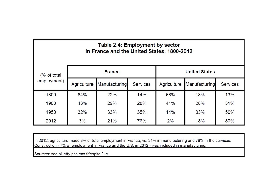
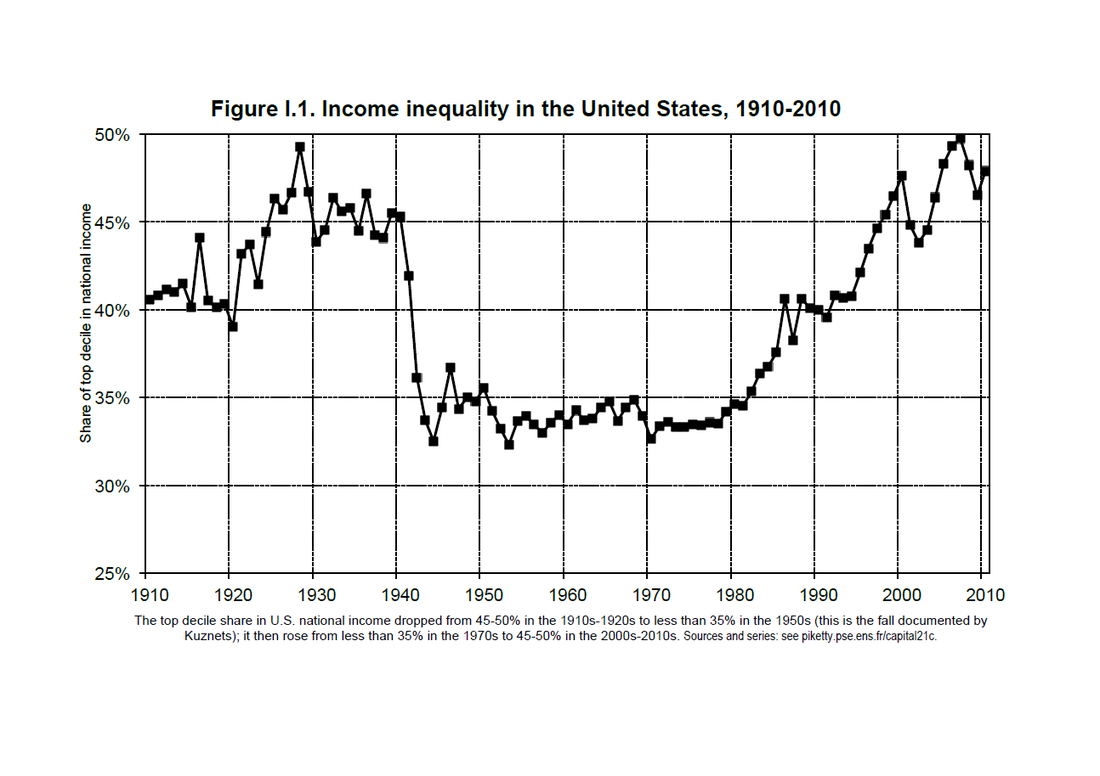
This resource is from Thomas Piketty’s Capital in the Twenty-First Century. This resource outlines changes in history utilising two forms of quantitative data presented in a table and line graph. The table shows the percentage of employment by sectors in France and US from the Industrial Revolution to the present. And the graph shows the level of economic inequality in the US from the start of the twentieth century to the present. A great deal can be inferred from this data; the table shows how Americas manufacturing industry grew after WWII, and the graph shows the rise of the American middle-class after WWII. In regards to the Victorian Curriculum, this resource could be linked to the level 10 content strand discussing the ‘changing social, cultural, historical, economic… and technological conditions on a major global influence’ (2016). This resource would be extremely useful in engaging students that respond well to logical and objective data. Therefore, this resource would help cater differentiation of learning because most of the resources used in the humanities tends to be linguistic or visual.
Reference List:
- Piketty, T 2013, Capital in the Twenty-First Century, The Belknap Press of Harvard University Press, Cambridge, Massachusetts.
- Piketty, T 2013, Employment by sector in France and the United States, 1800-2012, Table 2.4, Capital 21c, Paris, viewed 30 May 2016, <http://piketty.pse.ens.fr/files/capital21c/en/pdf/T2.4.pdf>.
- Piketty, T 2013, Income Inequality in the United States: 1910-2010, Figure 1.1, Capital 21c, Paris, viewed 30 May 2016, <http://piketty.pse.ens.fr/files/capital21c/en/pdf/F0.I.1.pdf>.
- Victorian Curriculum 2016, the Humanities: History Curriculum F-10 Levels 9-10, Victorian Curriculum and Assessment Authority, viewed 9 June 2016, <http://victoriancurriculum.vcaa.vic.edu.au/the-humanities/history/curriculum/f-10#level=9-10>.


 RSS Feed